


I worked on Flywheel, an enterprise initiative for Eli Lilly. As a Senior UX Designer, I focused on simplifying complex workflows, improving information clarity, and creating intuitive, scalable experiences in collaboration with product, engineering, and business teams.
Flywheel
I worked on UX design for reporting, risk management, and site activation workflows. My focus was simplifying complex data, improving information hierarchy, and creating intuitive experiences across different user scenarios.
Problem
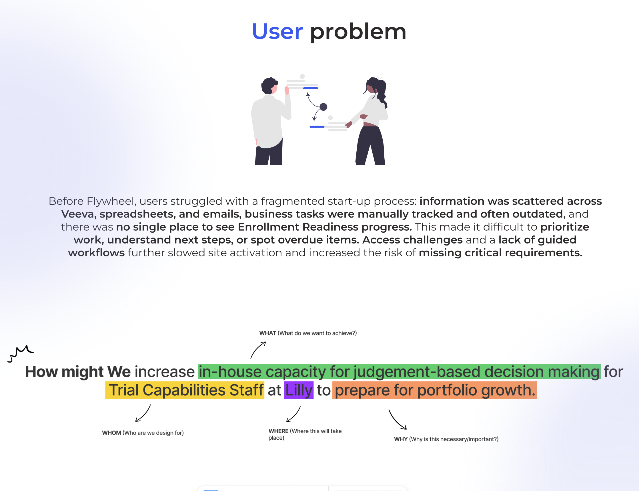
Getting a clinical trial site ready for patient enrollment involves many tasks, documents, and approvals. However, teams were tracking this work across Veeva, spreadsheets, and emails.
Without one clear view of progress, users struggled to understand what was missing, which tasks were overdue, and what they needed to do next. Manual tracking also made it difficult to keep information up to date and identify potential delays.
Goal
Our goal was to bring site start-up activities into one clear workspace, helping teams track progress, prioritize tasks, and understand what each site needed before it could begin enrolling patients.
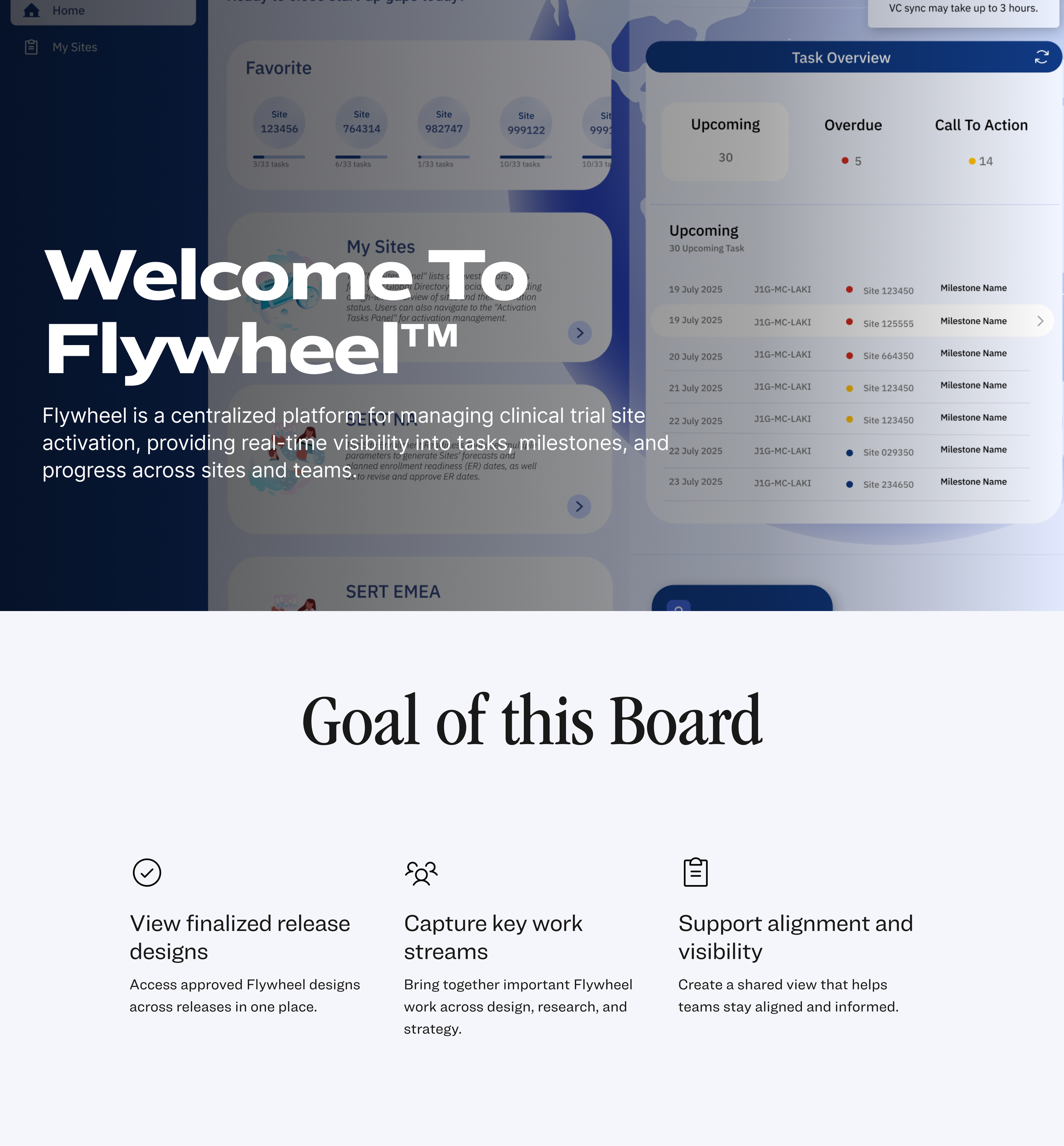
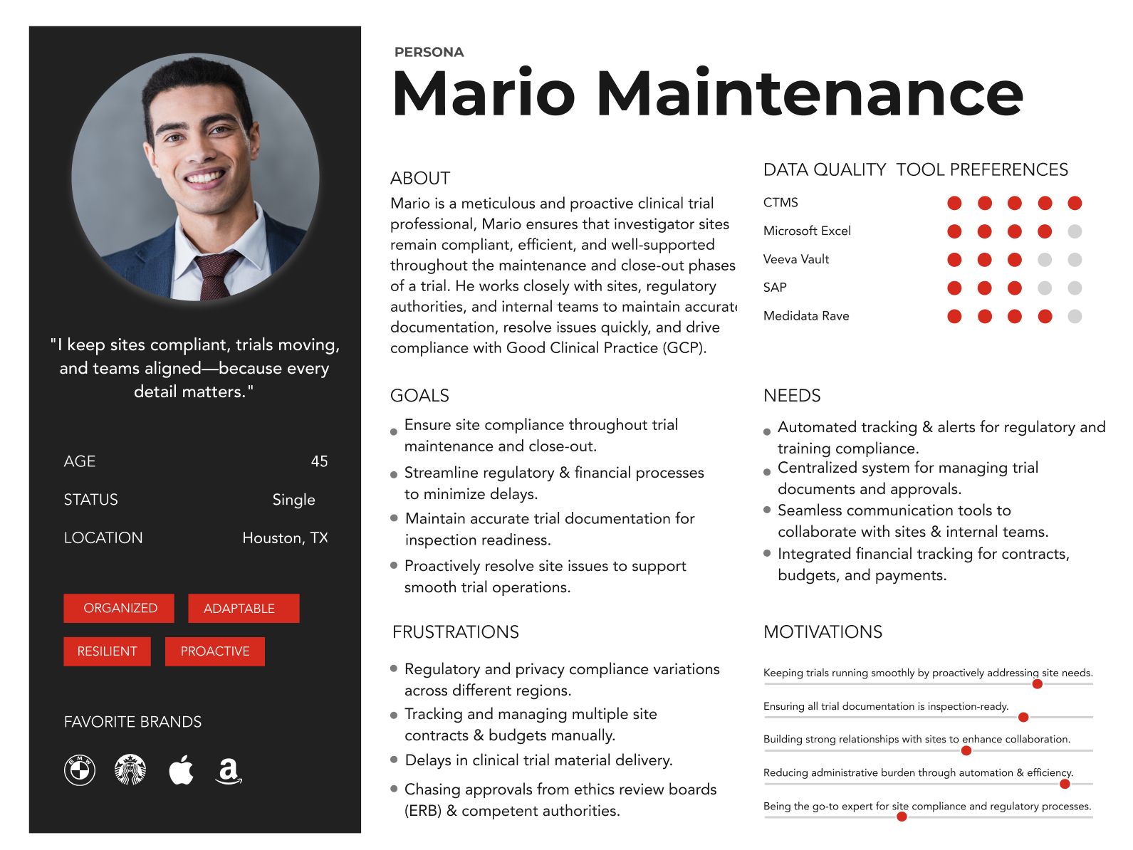
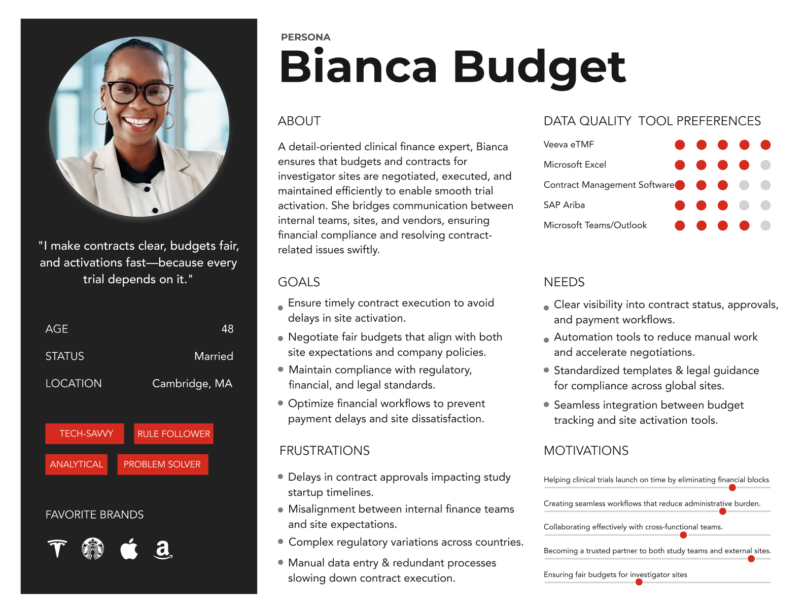
The platform supports teams responsible for preparing clinical trial sites for enrollment, including regulatory and study operations staff.
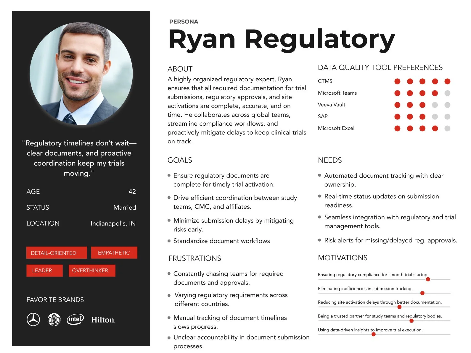
These users manage multiple requirements and coordinate with different teams. They need clear ownership, reliable status updates, and easy access to documents and contacts.
User Journey & Information Architecture
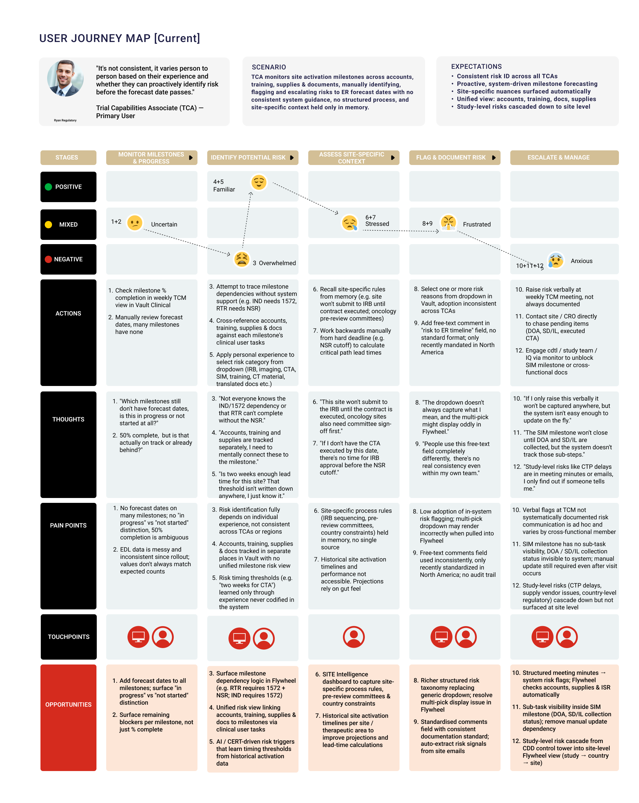
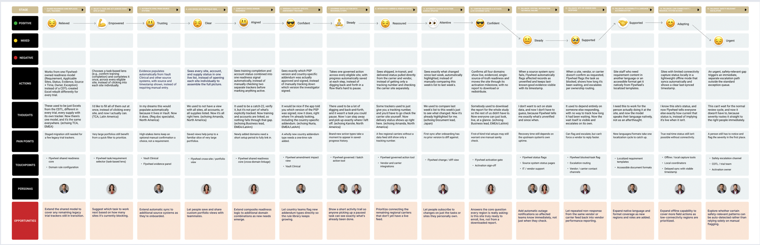
We mapped the journey from reviewing assigned sites to completing the requirements for enrollment readiness.
This helped us organize the experience around three main areas: the Home Dashboard, My Sites, and the Activation Planner. Users could start with an overview of their workload, find a specific site, and then explore its milestones and tasks
Wireframes
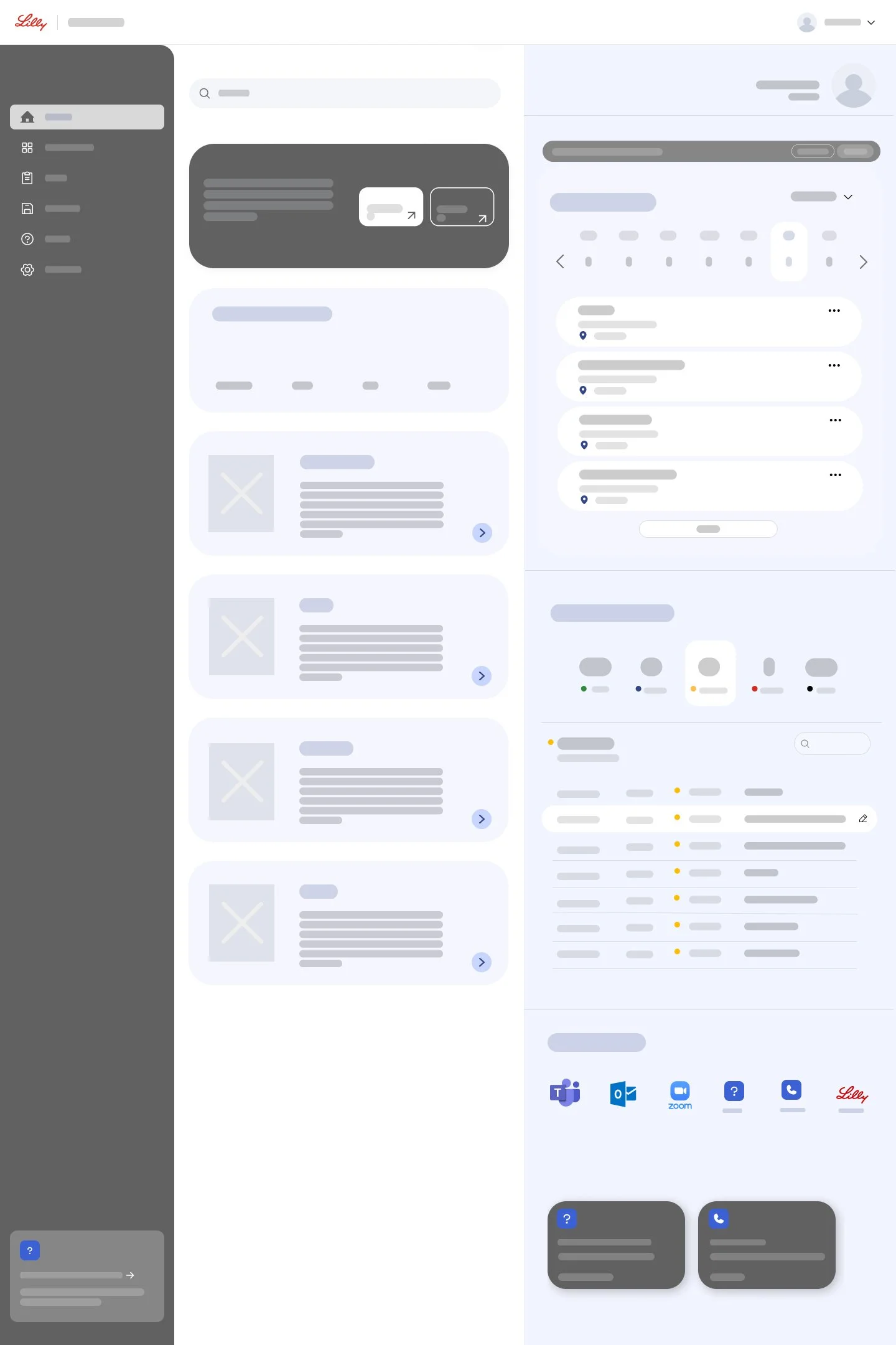
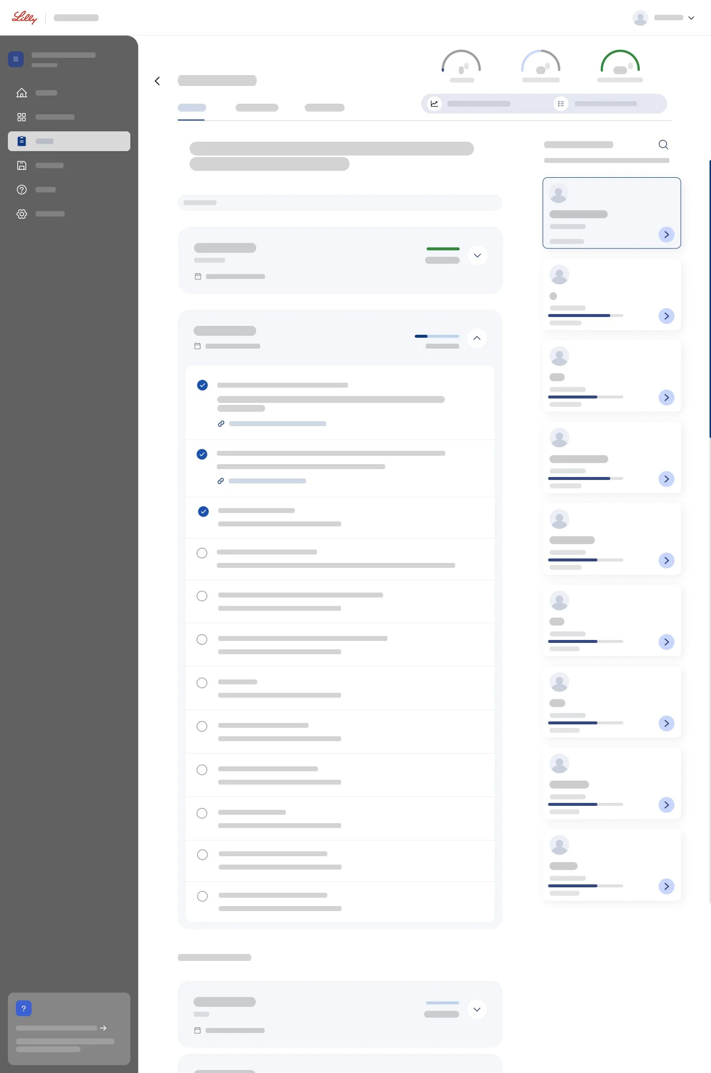
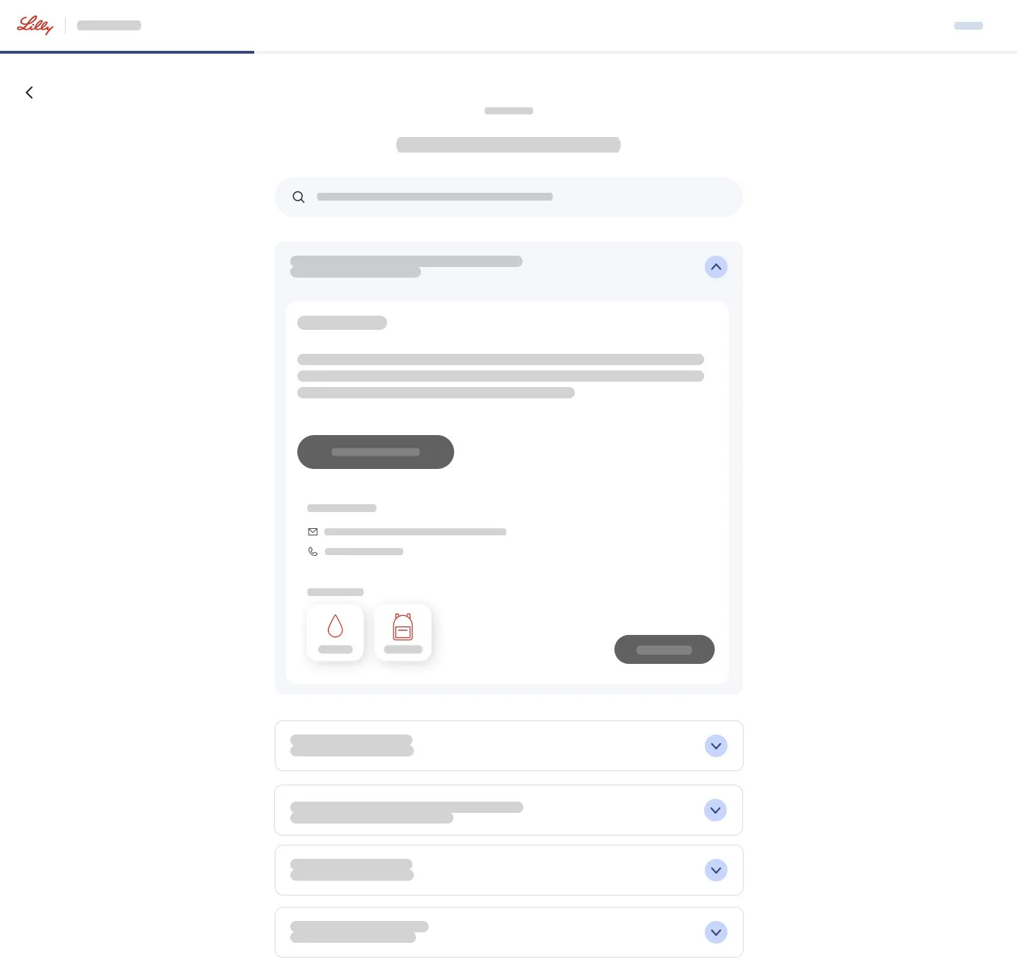
I used low-fidelity wireframes to explore how to organize complex information without overwhelming users.
The main focus was hierarchy:
showing overall progress first,
highlighting tasks that needed attention,
and allowing users to expand sections for more detail.
Visual Design
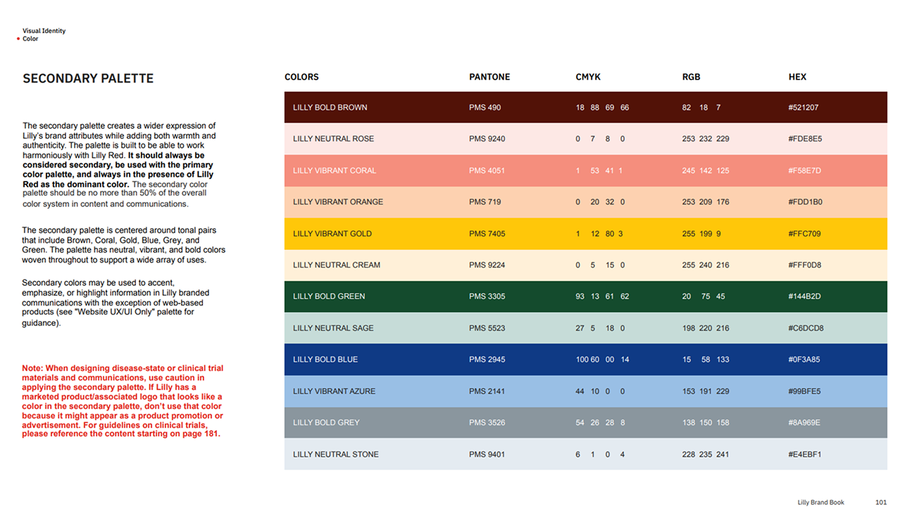
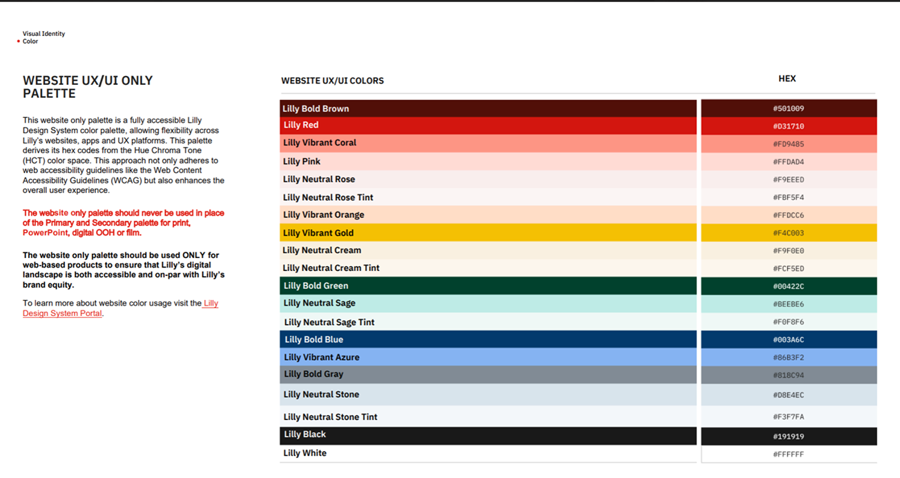
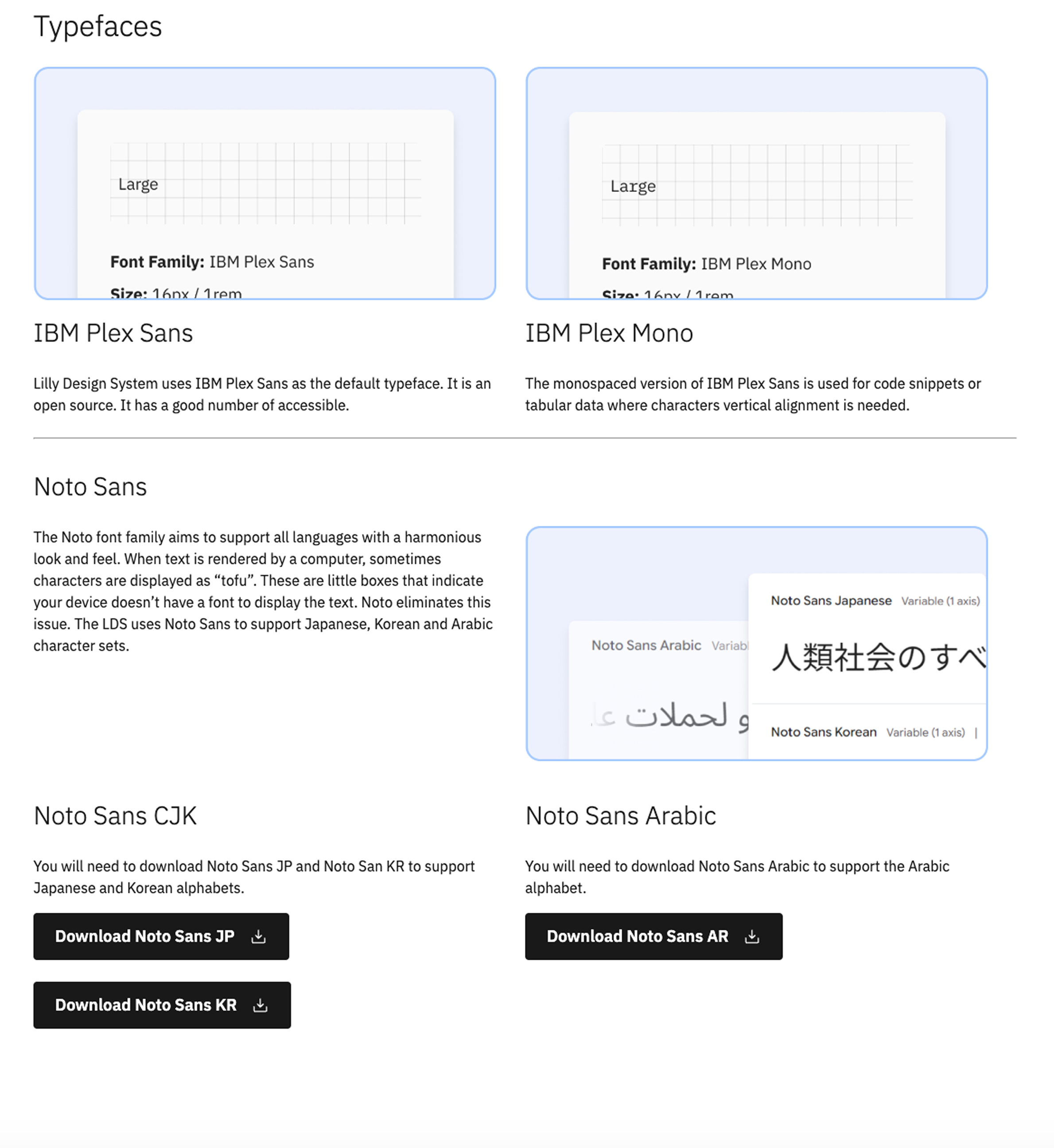
We developed a consistent visual system for typography, colors, icons, and reusable components.
Consistent layouts made it easier to move between sites and understand information quickly.
Due to confidentiality, detailed designs and project materials are not publicly displayed.
Outcome
The design brings previously scattered site start-up information into a structured workspace. Teams can review site progress, identify outstanding requirements, and find their next steps more easily.
The intended impact is less manual coordination and fewer avoidable delays on the path to enrollment readiness. Measuring time saved and changes in site activation timelines would help validate that impact.
What I Learned
This project reinforced that designing for complex workflows starts with understanding how people organize their work.
The most useful improvements were about making priorities, dependencies, and next steps easier to understand. A clear overview, supported by detail when needed, can make a complex process more manageable.